Web Accessibility Best Practices
In today’s digital age, ensuring that our website is accessible to everyone is not just a legal requirement but also a moral imperative. By adopting inclusive design principles, you can create a web experience that is welcoming and usable for people with diverse abilities and needs. This guide will walk you through essential strategies and techniques to enhance accessibility to make the web a more inclusive space for everyone.
The District website strives to attain at least Web Content Accessibility Guidelines (WCAG) 2 Level AA conformance. WCAG is developed by the World Wide Web Consortium Web Accessibility Initiative (WAI) and is the international standard.
There are three levels of conformance:
- Level A, the minimum level
- Level AA, which includes all Level A and AA requirements. Many organizations strive to meet Level AA.
- Level AAA, which includes all Level A, AA and AAA requirements.
Do's and Don'ts of Accessible Web Pages
To create a more user-friendly and accessible website, it’s essential to focus on how you present links, headers, and images. By following simple best practices, you can ensure that all users, including those using assistive technologies, find your content easy to navigate and understand.
When crafting accessible web content, the clarity and descriptiveness of your links play a crucial role. Here are some essential tips to ensure your links are effective and user-friendly for everyone.
Use Short, Descriptive Phrases
Link only small segments of a sentence, about 3-5 words, rather than entire paragraphs or sentences. Avoid generic phrases like "Click here" or "Read More." Hyperlinks can be used to navigate around the web page when using a screen reader. If your hyperlink is only the word here or phrase this page, it may become confusing or unclear which link leads where.
| Poorly formatted hyperlink | Well-formatted hyperlink |
|---|---|
| The training tutorial for new staff and faculty was released. | The training tutorial for new staff and faculty was released. |
| Read this report for more details. | Read the 2023 Annual Report for more details. |
Avoid Full URLS
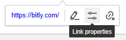
Do not use full URLs as link text. Full URLs can be cumbersome for screen readers to read out loud. On webpages, you have the power to make links far more readable. If you must include a URL, try to shorten it using tools like bit.ly to prevent them from displaying long strings of characters.
| Poorly formatted hyperlink | Well-formatted hyperlink |
|---|---|
| RSVP for the event: https://example-outlink-dot-com | RSVP for the 202X Gala on the event's ticket page. |
| Sign up: https://long-link-that-is-long-to-read | Sign up: bitly/fake-short-link |
Avoid Duplicate Link Text
Ensure that each set of words linked on the page leads to a unique URL. Avoid using the same words for different links. If two sets of link text both say 'Click here', it will be ambiguous to screen readers which link is which.
Consistent Link Text
Do not use different words to link to the same URL on the same page. Use consistent text for the same link to avoid confusion.
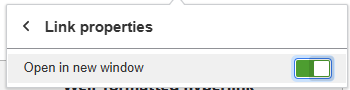
Linking Off-Site Resources
When linking to resources that could disrupt the user's current session on the website, make sure you set link properties to open this item in a new window. This will allow the user to keep their place on the website. If you are linking to an external website, PDF, or email address, it is best practice to toggle the "Open in a New Window" option on.
Effective alt-text is essential for making images accessible to all users, including those who rely on assistive technologies. Alt-text explains the information a graphic provides in the context of its usage on the page; it is not just a description of the graphic.
Alt-text should always be reviewed if generated automatically -- although technology is getting better at recognizing what an image depicts, algorithms alone cannot understand what an image means within the context of the overall page. A maple leaf might represent Canada, or it might just illustrate the leaf of a tree. Web page authors must provide alternative text that represents the content and function of their images.
Tips
- Skip Descriptive Phrases: Directly describe the content and purpose of the image without using phrases like “image of…” or “graphic of…” to avoid redundancy, as assistive technologies already announce the presence of the image.
- Keep it Brief: An alt-text description should be less than 100 characters.
- Avoid Redundancy: Do not repeat information already provided in surrounding text. The alt-text should add value by offering additional context not found elsewhere.
- Include Textual Content: If an image contains important text (e.g., a chart or a meme), include that text in the alt description to ensure it is accessible to users who can’t see the image.
- Link to Data: When using an image of a chart, include alt-text that briefly describes the chart and provides a link to the plain text version of the data on another page. This ensures users can access the detailed information easily.
- Keep It Simple: When in doubt, keep the description simple and straightforward. The goal is to convey the image’s purpose or content effectively without overwhelming the user.
Organizing your content with well-structured headers is key to creating a user-friendly and accessible website.
- Maintain Hierarchy: Ensure that headers follow a sequential order. For example, don’t jump from H1 directly to H4. This structure aids in readability and navigation.
- Be Descriptive: Use clear and descriptive text for headers to convey the content that follows. This benefits all users, especially those using assistive technologies.
- Avoid Redundancy: Don’t repeat the same header text multiple times on a page. Each header should provide unique and relevant information.
- Keep Header Text Concise: While headers should be descriptive, they should also be brief and to the point, making it easier for users to scan and understand the content.
Ensuring that your web page is visually accessible involves more than just choosing appealing colors; it’s crucial to adhere to accessibility guidelines and optimize text readability.
- Follow Accessibility Guidelines: Use color contrast tools to ensure your text and important elements meet Web Content Accessibility Guidelines (WCAG) contrast ratios. Aim for a contrast ratio of at least 4.5:1 for normal text and 3:1 for large text.
- Consider Font Weight and Size: When creating a graphic image for the website, choose fonts that are easily readable at various sizes and weights. Heavier or larger fonts can improve readability against contrasting backgrounds. Do not go lower than 8 pts.
When designing tables for your website, ensuring accessibility is crucial for users who rely on assistive technologies.
- Include Table Headers: Define column and row headers. This provides context and improves navigation for screen reader users.
- Provide Descriptive Captions: Use the caption element to give a brief description of the table's purpose. This helps users understand the context of the data.
- Avoid Nested Tables: Nested tables are tables within tables. They are difficult for assistive technologies to interpret.
- Use tables for data only: Do not use tables as a design tool. If your table doesn’t have a header or data within a cell, it is not being used for its intended purpose.
PDFs can inherently create barriers for people using assistive technologies, such as screen readers. It is best practice to avoid using a PDF where a simple web page will do.
PDFs should be reserved for:
- Fillable forms
- Organizational charts
- Voluminous documents, such as agenda packets and handbooks.
If you do plan to post one of these types of PDFs, it is imperative you ensure it is accessible before you upload it to the website.
Naming Your PDF: When you save the PDF you plan to post, name it (or rename it, depending on the case) using hyphens to separate words. Do not leave spaces in the PDF's name and delete any unnecessary numbers or words. Remember, screen readers will read out loud an entire URL. If you leave spaces in the name of the PDF, the site will automatically fill the space with "20%."
The added bonus to naming your PDF correctly, is that it'll be easier to find using a search engine like Google or Bing.
Examples:
- Do Not name it: Sports Marketing Representative.pdf (this will turn into "Sports20%Marketing20%Representative" in the URL)
- Do name it: sports-marketing-representative.pdf